
This is the first draft of my poster for my film. As my film is of the horror genre, black is a colour most representable of fear. For this reason i used the black colour as my background colour. The black highlights any important information i would add onto my poster.
For the images i used on my poster i used shots of the same police board from my trailer and cropped them into more individual pictures and then over lapped them on my poster. This ment i could make the more important sections of the board larger and more noticable where as i could add more parts of the board which are not as important and i could use these to fill in the gaps of the poster so the black background wasnt showing too much.
i thourght that over lapping the images would give a better effect as the person looking at the poster would not be able to read all of the fake headlines that we made for the police board. I put on the poster the most important parts for example the 'killer caretaker' headline and the picture of the main girl character when she was younger and when she was older which allows the audience to make the connection themsleves instead of having everything made easy to understand.
i added anouther picture of a hand holding a knife which is covered in blood. This is a section in our trailer also and this is anouther connection between the too that the audience can make. I made sure all the edges of the pictures were blured to give a more old and scary effect to my poster.
I used i black text for the title of the film even though my background is also black. I then made the back ground fade out a little bit more at the bottom compared to the top so this ment that the black text of the title would then stand out ontop of the grey background colour. I also added the line 'coming soon to cinemas near you' to give realism to the poster.
I think that the over lapping effect is good and works well to give the effect of not being able to see all that is written on the poster but only being able to read the important parts. It gives me more control onto what i want the audience to be able to read and what i dont want them to know just by reading the poster. The text maybe isnt right for my poster and does not stand out as much as it should. I should maybe use the same text as has been used in the trailer.
This is the second draft of my poster:

Like the first i kept the over lapping of the pictures because i think this works well with the background and gives the poster a good effect.
I have moved my pictures further down the page to change the layout slightly so i could put the title of the film at the top to see what that looked like. I think having the title at the top looks and works better on the posters because it draws the eyes straight to the title and makes the audience look down the poster so they dont miss anything.
I also changed both texts on the font of the title and the font of the 'Coming soon to cinemas near you' line. I prefer the titles new font type from the first draft but the other lines font is too gothic for this poster. I kept the colours the same though. Keeping the title in black and the tag line in white shows opposition.
I like the layout of this poster more than the first draft i think it looks better with the images more centered with the title straight above. I think another image is needed for example a picture of a caretakers tools or a garden rake for example.
I also changed all the background to being grey instead of just having the bit behind the title being another colour to make the title to stand out. I dont think this works as well because i think it is too light and doesn't have as much contrast with the white text.
This is my final poster design that i would use for my film:
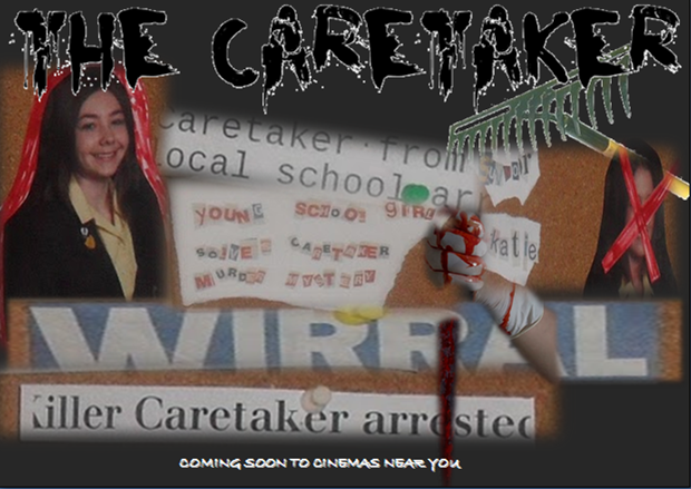
This is my final poster design for my film. I firstly didnt go for a all solid black background but i went one shade lighter so that the black title of my film would stand out.
I kept the title font the same as in my second draft because i thourght that the style i had chosen suited the film as it being of a horror genre the text font should be a little strange.
I kept the tag line as white but i changed the font style to a long lettered type. It makes the tag line stand out more and look like it's been scratched and this gives a scary effect to my poster.
I also added another image of a garden rake. This image can say many things from just being present on the poster. It could be there just for effect to show about the title being 'The Caretaker'. Or it could be there to maybe show what he used to kill his victims.
If someone who has seen the trailer would be able to make the connection from the trailer to the poster by the images of the police board. I wanted to keep one thing the same through out the trailer, poster and magazine cover range so that the audience would be able to associate them with each other.
I also added a white outline around the the font of my title which made it stand out yet again. I think that this layout and design of poster for my film works the best for an advertisment for my film.
Through out all three of my posters i have not used a tagline to accompany the title of my film. I did not feel that in the trailer there was a line we had used which was catchy so that the audience would remember the film from one line. All of the film posters i have looked at have has a tagline. Not having a tagline i dont think will affect the audience being able to remember the film .
No comments:
Post a Comment