Tuesday, 10 May 2011

My evaluation

What have you learnt from audience feedback?

I carried out my own audience research to find out my own feedback. I found out by asking other pupils at the school what they thought about my trailer. I found that the majority thought my trailer asserted itself with the horror genre. The other members of the audience who watched my trailer believed it was more of a mild horror but more thriller.  I also carried out a questionnaire to see if audience members understood the narrative of my trailer.

 Most of the feedback concluded that they did and the others said that after a second or third viewing they understood it then. I carried out another questionnaire but due to the sample sizes being too small the results were not valid.

I have found that audience feedback is extremely important. The reason for this is, if I was to make a trailer again every so much editing I would then ask them to watch the trailer again and see if what I had changed worked better. However with this comes a problem, I would have to change the audience members because otherwise my trailer would become too suited for those few people.  I could have a few groups of people I could alternate.

How effective is the combination of your main task and the ancillary tasks?

I feel that all three of my tasks (trailer, poster and magazine cover) work well together due to the continuity between them. I kept the same picture for the magazine cover and the poster. This allows the readers make the connection between them due to the same picture.
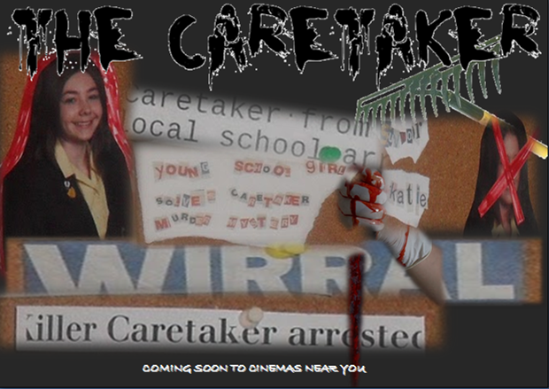
I believe that all three together would work effectively due to the fact the posters image is relevant to the trailer itself as it’s the same image and also on the magazine cover. Straight away from the trailer the audience can work out who the main character is, so on the poster just using the ‘caretakers kill board’ was a good connection so the audience know who the girl on the board is and will associate her with being the girl in the trailer. I used the poster image on the magazine cover because that is the main image the audience would remember. If I had put another image of another part of the trailer on my cover the audience would not have maybe realised that this was the featured film in that issue. The poster would have been displayed in cinemas, bus stops, bill boards and on the side of taxis. For this reason I needed something which could be remembered and something that was eye catching but also stayed in the colours of the genre and trailer.

I feel that from audience feedback that our film would appeal to an audience and would be wanted to be viewed. I would give the film a 15 certificate because most of the audience sample I showed the trailer to was 15/16 years of age but older audiences said that the trailer was good and they would watch the film but it was not as scary for them as it was to the 15/16 year old viewers. This meant that my trailer was effective by making people want to watch my film by viewing the trailer.  The feedback about the poster was similar. People who had seen my poster had said they would like to see the film which was good feedback, but because I didn’t want to use unknown images from the internet I used the pictures of the ‘caretakers kill board’ the detail of the image once made large enough for the poster became slightly grainy. This gave the image I good effect as you could still see what the picture was of and who, but it gave an old, worn effect which was what I wanted.

All of the audience members I asked about the poster and the trailer together said that yes they would recognise that the poster was being used in conjunction to the trailer and they would also associate them together. The magazines normal audience would buy the magazine as normal and would learn about the film and see the poster inside so that the next time a reader saw the poster else where they would  know about the film and know what film it was for.


How does your media product use develop and challenge conventions of real media products?

We used the normal stereotypical conventions of a horror movie trailer after looking at plenty through the research process. We decided to use technology such as a slow motion camera and green screen. Unfortunately we did not use the green screen footage in the end but we still have the skills now about how to use the green screen and what the effect looks like.  We wanted to break the mould by using a telephone call to tell the story which works well at the end. We used a phone call which was to the police which immediately installed fear and panic into the audience because the only reason the police is called is for bad things or people in trouble.

We wanted to make our trailer as real as possible so we used the typical conventions such as the synchronicity between the music and the images. This gave our trailer a pace and rhythm along with the heartbeat sound affects this gave our trailer a professional feel.
The challenge we had at the beginning of the task was to make the trailer, and through doing this we discovered more challenges we could take on as we became accustomed with the technology. We set the challenge as being to be able to make a trailer with a matching poster and magazine cover which would appeal to people to come and watch it. Well we did this. From my own personal audience feedback I have concluded that over half of the sample audiences would come to view the film.

We challenged other tasks such as using the green screen and slow motion camera, even using an apple Mac was a challenge because neither Louise nor I had used one before. Trailers made of today’s standard are full of technology like what we used to this meant that using it would make our trailer look up to date and of the time period we wanted.

Another challenge we were faced with was being able to tell the audience our narrative by watching the trailer but not giveing too much away. From the audience feedback it was clear that 7/10 understood the narrative the first time they saw the trailer but the other three needed to watch the trailer a second or third time.

How do you use media technology in the research, planning, ancillary and main production?

We used a lot of new media technologys through-out the task.
.slow motion camera
.green screen
.Apple Mac
.I-movie
.blog
.editing software
.digital camera

These were some of the main media technologys we used to make our trailer. The slow motion camera was the most important to catch something iconic that the eye can not see. We chose the image of blood dripping onto snow. It was snowing at the time so we used red food colouring and dripped it onto the snow capturing it with the camera. The results were increadable showing you every flake of snow that moving when hit with the colouring and the drip itself falling slowly.

The green screen we used and became used to but unfortunatly did not use the actual footage we shot in the trailer. Once we had a firm idea on what we wanted from the trailer the green screen footage was no longer relevant. However just being able to use it was a great experience because i now know how it works and what the final footage looks like.

Using a simple digital camera we shot most of the footage. Normally only taking pictures with it, it was a new experience and challenge to have to use it on filming mode and see what lights worked the best and what way the camera should be held to shoot certain footage.

Using the apple Mac was  great fun as i had never used one before. At first is was hard to come to grips with how to work one and where everything was, but once i had understood it and had started editing everything else came with trail and error. The software we used to edit was I-movie. It is in fact what some studios use to edit their trailers and even even films so it gave a great sense of realism knowing this.

Having to use a blog to record and post all my research and planning was easy to learn how to do but had several downsides. Not being able to post because of technical difficulties was fustrating, and even worse was when the site would crash and loose your work.

Over all the experience has been increadable and has really helped me to be able to understand media software easier. Being able to make my own film trailer has been such good fun and i now have something to be proud of making.

Friday, 6 May 2011

My Film Poster

This is the first draft of my poster:


This is the first draft of my poster for my film. As my film is of the horror genre, black is a colour most representable of fear. For this reason i used the black colour as my background colour. The black highlights any important information i would add onto my poster. 

For the images i used on my poster i used shots of the same police board from my trailer and cropped them into more individual pictures and then over lapped them on my poster. This ment i could make the more important sections of the board larger and more noticable where as i could add more parts of the board which are not as important and i could use these to fill in the gaps of the poster so the black background wasnt showing too much. 

i thourght that over lapping the images would give a better effect as the person looking at the poster would not be able to read all of the fake headlines that we made for the police board. I put on the poster the most important parts for example the 'killer caretaker' headline and the picture of the main girl character when she was younger and when she was older which allows the audience to make the connection themsleves instead of having everything made easy to understand. 

i added anouther picture of a hand holding a knife which is covered in blood. This is a section in our trailer also and this is anouther connection between the too that the audience can make. I made sure all the edges of the pictures were blured to give a more old and scary effect to my poster. 

I used i black text for the title of the film even though my background is also black. I then made the back ground fade out a little bit more at the bottom compared to the top so this ment that the black text of the title would then stand out ontop of the grey background colour. I also added the line 'coming soon to cinemas near you' to give realism to the poster. 

I think that the over lapping effect is good and works well to give the effect of not being able to see all that is written on the poster but only being able to read the important parts. It gives me more control onto what i want the audience to be able to read and what i dont want them to know just by reading the poster. The text maybe isnt right for my poster and does not stand out as much as it should. I should maybe use the same text as has been used in the trailer. 


This is the second draft of my poster:


Like the first i kept the over lapping of the pictures because i think this works well with the background and gives the poster a good effect. 


I have moved my pictures further down the page to change the layout slightly so i could put the title of the film at the top to see what that looked like. I think having the title at the top looks and works better on the posters because it draws the eyes straight to the title and makes the audience look down the poster so they dont miss anything. 


I also changed both texts on the font of the title and the font of the 'Coming soon to cinemas near you' line. I prefer the titles new font type from the first draft but the other lines font is too gothic for this poster. I kept the colours the same though. Keeping the title in black and the tag line in white shows opposition.


I like the layout of this poster more than the first draft i think it looks better with the images more centered with the title straight above. I think another image is needed for example a picture of a caretakers tools or a garden rake for example. 


I also changed all the background to being grey instead of just having the bit behind the title being another colour to make the title to stand out. I dont think this works as well because i think it is too light and doesn't have as much contrast with the white text.


This is my final poster design that i would use for my film:


This is my final poster design for my film. I firstly didnt go for a all solid black background but i went one shade lighter so that the black title of my film would stand out. 


I kept the title font the same as in my second draft because i thourght that the style i had chosen suited the film as it being of a horror genre the text font should be a little strange. 


I kept the tag line as white but i changed the font style to a long lettered type. It makes the tag line stand out more and look like it's been scratched and this gives a scary effect to my poster. 


I also added another image of a garden rake. This image can say many things from just being present on the poster. It could be there just for effect to show about the title being 'The Caretaker'. Or it could be there to maybe show what he used to kill his victims.


If someone who has seen the trailer would be able to make the connection from the trailer to the poster by the images of the police board. I wanted to keep one thing the same through out the trailer, poster and magazine cover range so that the audience would be able to associate them with each other.


I also added a white outline around the the font of my title which made it stand out yet again. I think that this layout and design of poster for my film works the best for an advertisment for my film. 

Through out all three of my posters i have not used a tagline to accompany the title of my film. I did not feel that in the trailer there was a line we had used which was catchy so that the audience would remember the film from one line. All of the film posters i have looked at have has a tagline. Not having a tagline i dont think will affect the audience being able to remember the film .

Wednesday, 4 May 2011

Magazine Research

A list of all the Film magazines.
Boxoffice
Box office results, top ten, movie reviews.
Bright Lights
One of the best film magazines online that examines classic, commercial, and independent films from a wide range of vantage points from the aesthetic to the political.
Cineaste
Selected articles from the magazine on the art and politics of the cinema.
Close Up
Online UK film magazine. Find reviews, features and interviews for new cinema and dvd releases, articles on independent, low-budget and regional filmmaking, more.
eFilmCritic.com
Australian movie magazine offering film reviews by visitors to the site.
Empire
Features news, reviews, top movies, upcoming releases, box office results (UK), forum, and more.
Errata
Presents collection of essays, reviews, commentary, and discussion about cinema.
Eye For Film
UK site with movie reviews, news, critique and festival coverage.
Film Comment
Quality magazine providing articles on films old and new, foreign and domestic, narrative and documentary.
Film Journal
Movie reviews, news, and interviews for Hollywood, indie, and foreign films.
Film Threat
Covers cult films, underground shorts, alternative films and independent features.
Filmink Magazine
Provides film news and gossip, movie reviews, video and DVD releases, Australian and international film industry information.
Filmmaker Magazine
Presents an insider's perspective on the world of independent filmmaking, including: interviews, case studies, financing and distribution information, festival reports, technical and production updates, and more.
Films in Review
Online version of the oldest film magazine in the US. Find reviews, interviews and feature articles.
Future Movies
British movie review guide features profiles of new movies, cinema releases and latest DVD reviews.
Guardian Unlimited Film
Film news and reviews from the Guardian and Observer newspapers.
Hollywood Reporter
Newspaper providing movie reviews, box office info, entertainment and celebrity news, more.
iF Magazine
US magazine on indie filmmaking.
Images Journal
Quality reviews and analytical articles on old and recent movies, and popular culture.
Inside Film
Provides news and information on the world's film festivals.
Kamera
Intelligent UK magazine that mainly concentrates on arthouse and independent films.
MovieJuice
Hollywood's movie satire site.
movieScope
Magazine explores the various aspects of filmmaking from the perspective of the filmmakers themselves.
MovieMaker
Guide to independent film and filmmaking from around the world.
Premiere
Features Hollywood movie news, reviews and previews, celebrity interviews and inside stories.
Preview
International magazine packed with information on the latest big screen movies.
Rotten Tomatoes
Reviews and previews of Hollywood movies and videos from the nation's critics.
Screen
Online edition of the bollywood weekly magazine offering Indian movie news and interviews with stars.
Screendaily
Daily film industry news from around the globe, reviews from the world's leading festivals and box office comment from every major territory.
Senses of Cinema
Online film journal devoted to the serious and eclectic discussion of cinema.
Sight and Sound
Well-known magazine from the British Film Institute. Features top ten movies, the best film music, in-depth interviews, retrospective articles and news.
Strictly Film School
Online journal offering a collection of short essays featuring the respective filmmaker's notable films.
Uncut
Popular UK music and film magazine. Features hundreds of music and movie reviews, interviews and news. 


Total Film Magazine front cover deconstruction. 


This magazine front cover is an extremely busy cover with something in every corner to attract an audience to read it.  The main image is a group of four with the picture of them taken from looking up to give the effect of the group being of greater/higher authority than the individuals reading the magazine.  The individuals on the cover are in character giving the other effect that it is not the actor/actress that is of greater importance than the audience and that it is in fact the character itself. The characters shown on the cover are relevant to what is inside the magazine. For an example in this issues case the main film being written about is the ‘x-men’ so the characters are from the film and the audience can make that connection.

The colour scheme of the magazine cover in this case is very dark. I have looked at many other front covers from the same ‘Total Film’ company and have discovered that the title of the magazine displayed at the back of the cover in block, full capital text is usually in white which is a good contrast with the usual bright colours of the cover. However in this case the title of the magazine is in the metal effect fonts with a grey/metallic colour to connect and match the rest of the colour scheme on the cover which are also mostly misty greys and blues. The way the picture of the characters are positioned slightly over lapping the title shows that the magazine is well known and the audience/ readers it already has will recognise the magazine cover by the font or another feature so wouldn’t automatically look out for the stereotypical white title.  

The rest of the text on the covers are following the normal colour white and have added another eye catching colour to then be using the rule of three. This would be the grey, white and orange that would all act to catch new reader’s eyes. Because the whole theme of the magazine cover is quite dark, the white text lights the whole feel of the cover up a little and unlike the normal ‘Total Film’ magazine covers, this issue does not have a bright coloured background with a picture on top, in fact this covers picture is the background.

The usual magazine necessities are included such as the barcode and the ‘puff lines’ which indicate about other features inside of the magazine itself. Competitions are mentioned on the cover slightly highlighting other things which are inside.

New feature films which are released would be on the front of a film magazine which is another great way for advertisement. Not only would the film be advertised to the less enthusiastic members of the population via bus posters, bill boards and television but also to the members of the population who do love film and would by the magazine. The fact the film would be mentioned and talked about inside the magazine would entice the audience who have already seen it but would also attract the people who yet were to still see the film but just want to know the facts about it already and maybe see what other people thought of the film and what the critics had said more importantly.

The other text around the magazine balances out the darkness of the image and lets the reader know what is inside the magazine without having to actually open to the contents page to finds out. The cover has a mixture of bold text and smaller less noticeable text on it to make the reader read around.
The name of the film is first noticeable but the boldness and the way the title has been centred on the cover just underneath the image which relates to the text. There is another group of writing at the bottom of the cover which has been split into three using an orange chequered block which also balances out the white and orange because the text is in white.      

The way in which the Title of the featured film is set out with the tag lines under and so on gives the impression on a skull but the way the magazine has added a simple ‘+’ shape in the same chequered pattern as the separators on the bottom of the cover. This gives the impression that death is featured in the film and that the darkness is to do with death along with the colours of the cover. With the white text at the bottom also shown looks like the skull has teeth.


Deconstruction of empire magazine.


This magazine front cover is for the company called ‘empire’.

This magazine issue was focused on the new feature film called ‘Hellboy’.

The main image is of a character from the featured film. The audience would portray the character on the cover as being the main character as they are the only image on the cover. The fact that the main image takes up most of the space on the cover also shows that the character is quite important as a character in the film. The images main colour is red which is made to stand out by the dark black background. Like the other magazine covers the character on the front is looking straight at the camera. It is extremely rare to find a magazine cover where the person on the front is looking away.  The fact the character is looking straight at the camera adds a personal feel to the audience because of the fact the readers will feel like the character is looking at them.

 The title of the magazine ‘Empire’ is slightly covered by the image which means that the audience would recognise the covers set out/title font to be able to know what the magazine is. The title is written in the same recognisable font and size but for the special featured film the title has taken the effect of being on fire to be in the same theme as the image. For people who have already seen the first of the ‘hellboy’ films would understand that fire is a major part of the film and even if it wasn’t, fire is a connotation of Hell and red. As well as the title being in red there are a few other sections of text which are also in red, for example the date and issue number however apart from that the rest of the text on the cover are in white which balances the black. Along with the white text as ‘puff lines’ underneath them there is a small description of what the page is about. This is the same font as the white text but is a smaller text size which shows the importance of it is quite small. The way the text size goes down shows the order in which the text is most important for an example the title is the biggest and then the ‘puff lines’ or headings are next in size and so on.

There are three colours which are on the front cover which are red, white and beige. This is another rule of three which is used. The use of the three colours was also used on the other covers I have seen like ‘Total film’ which used grey, orange and white. The title of the main featured film in the magazine is centred and is a larger text size than the other text apart from the title. The title of the film is over lapping the picture of the main character but stands out more as the text is white and has good contrast between the red. 

The magazine cover also includes all the normal and stereotypical information such as the barcode, the publisher, issue number and the date.

This cover would work along with the trailer being shown on television. There would be other ways of advertising the film for example on the side of buses and on bill boards. If they all had the same image the audience would make the connection themselves. Seeing as the main character is all red the connection can be easily made as just the character would be an advertisement in itself.  


My Film magazine Drafts 

This is my first draft of my film magazine front cover:


This is the first draft of my magazine cover which was to feature my film. I wanted to keep one feature the same through out all three of my products. I decided that one thing which was quite important was the police notice board. This one image could give a lot away to the audience. On my first draft i took individual parts of the board and over lapped them differently to the poster and how they were on the board in the trailer. This gave a good change from the poster and although looking the same and being recognised as the same film, the layout was different. I took out some of the headlines from the poster which wernt needed because it made the magazine look too full of text. 


For the title of my film i wanted to chose a font where the capital letters would stand out and be considerably larger than the lower case letters. This would make the F, O and other F stand out allowing the readers of my magazine to recognise just the letters/word FOF. I wanted to chose a font that also looked fun and not tied down to one genre for example text that looks scary would be for a horror magazine, therefore because my magazine talks about all genres i needed a broad font type. For this reason i picked a text which looks fun, neat and plain but still gives a good recognisable title.The text and font styles for the tag lines around the magazine i kept the same to keep it consistant through out the cover. This on the otherhand made it look boring and plain which didnt make the rest of the magazine look eye catching.


The one main set of images i had used only covered a third of the magazine so most of the colour was the one background colour coming through. This made the purple background a very dominant colour which wasnt balanced by any other colour on the cover. As i have seen from other magazine front covers, on most they have three main colours which are used all over the front cover. 


I chose my three colours as being purple, black and white. I have the purple as the back ground and then i have the black and white as opposites for all the text on the cover.I put some of the tag lines in capitals and some tag lines in lower case this gave variation to the text on my cover. 

I also added another picture of a pair of 3D glasses which went with a tagline i have included on my cover which is about a competition about winning tickets to watch 3D movies in the best cinemas around. 


I also included a barcode which added a sense of realisum to my magazine cover. 


My second Draft of My magazine cover: 


This is the second draft of my magazine cover. I decided to keep the title font the same because i think it works well with the all round genre of my magazine. As well as keeping the title the same font and colour i used the same colour background. I liked the background colour and the two together were eye catching.


For the image of the featured film on this draft, i used the films poster itself and not other photos. This gave a section of the trailer which could be associated with the poster and the magazine. Using the poster also filled a bit more space on the cover and showed less of the background colour which was visable a bit too much on the first draft. 


I changed more of the text tag lines to being more of a black and white range and not mostly white with black highlighted words. 


As well as this, i added another picture to one of the taglines which covered more of the background. 


I used a block strip of a darker purple to seperate the title from the poster on the cover. As well as seperating the cover up into sections the darker purple strip gave a bit more detail to the magazine cover.I changed a label of text to the same colour as the darker strip so it didnt look out of the blue there just being a strip of darker purple for seperation purposes.


I decided to keep the layout of my magazine cover the same as all of the magazine covers i had researched into had the main title at the very top of the magazine and sometimes the title were partially covered by the image used.


I kept the layout of the image and text the same as well. This is mainly the same layout for all magazines. It is a simple layout which leads the readers eye around the page so they do not miss anything on the cover. 


This is the third and final draft of my Magazine cover:  


This is the final draft of my magazine cover. 
I decided to keep the layout the same as usual. Behind the title i added a white box to make the title stand out even more. I also did this to add more of another colour to the cover. I kept the seperation strip of the darker purple colour because it worked well. The white block behind the title also covered more of the background colour.

 I also kept the position of the image the same but made the image/ my film poster slightly larger to cover a littlebit more of the background colour.

the main change i made on my final draft was to make each and every tag line on my cover a different style of writting to give my poster a bit more of an interesting look. Each different font style has been matched to the tagline it is being used for. For an example the font used for the tagline about having a competition is fun and funky but this font style would not have been used for a more serious matter for an example the interviews.


Thursday, 27 January 2011

My Media Research For My Film

This is my own personal blog where i will keep up to date on what research i have done.
My research will be on film trailers, specifically horror as that is our genre, looking at what works in the horror film trailers for example in the best horror film trailers do you see the monster? What colours are used? Is the full terror shown in the trailer or is that hidden for the full length film?, deconstructions of other film trailers, music used, film shots which give the best feel to that specific scene.
First of all me and Lousie decided on the genre of our media trailer, automatically we both jumped at the chance to make a scary trailer. The first part of my reseach started then which was the research into the top 50 scary movies of all time which i collected off boston.com. The 50 films was the following:

50.Arachnophobia
49.The innocents
48.Book of shaows:Blair witch 2
47.Willy Wonka and the chocolate factory
46.The Wicker man
45.The Blob
44.Rosemary's Baby
43.The Brood
42.Event Horizon
41.Dawn of the dead
40.Eraserhead
39.Amityville horror
38.Pet Sematary
37.Open Water
36.Nightmare on Elm Street
35.The Fly
34.Salems Lot
33.Gates of Hell
32.Session 9
31.In the Mouth of Madness
30.Altered States
29.Mouthman Prophecies
28.The mist
27.Videodrome
26.Seven 
25.War of the world
24.Saw
23.Janghuia, Hongryeon (a tale of two sisters)
22.The silence of the lambs
21.Texas chainsaw massacre
20.Hellraisers
19.The Changeling
18.28 days later
17.Pans Labyrinth
16.Jacobs Ladder
15.Jaws
14.The Exorcist
13.Quatermass and the Pit
12.Cloverfield
11.The Shining
10.Audition
9.Halloween
8.Evil Dead 2
7.Dawn of the Dead
6.Invasion of the Body Snatchers
5.Alien 
4.The Ring 
3.Rec
2.Ju-on
1.The Thing


Deconstruction of the top 5 trailers:

5.

At number 5 is Alien. When Alien first came out to the cinema it was labeled the scariest film of all time. At the time in which the film was made special effects like todays only existed in directors dreams. When i watched the trailer it was clear how this film was scary and still is. Ater watching the trailer a few times i have seen a few things which are very typical of a Alien film.http://www.youtube.com/watch?v=-eIpvZsEky4

During the trailer there are 6 seperate diiferent moments when there is a fade to black transition and green text is displayed. The green text displayed on the screen is shortened quotes or tag lines which give the audeince more of a feel of the films narrative and add more suspence. At 1 minute and 7 seconds in the trailer the last of the 6 tag lines is shown and from then on the trailer then becomes a lot more fast pace and quickly edited compared to before the last tag line when the lines fitted with the pace slowing the pace of the trailer down.

The first shot is of a space craft in outer space which starts at 6 seconds and ends at 13. This shot is quite long for the first shot but it is a good way of establishing the where abouts of where the film is being set. The fact the spave craft is alone, rather large and not the stereotypical NASA spaceship shows that the film is set in the future.


The next sequence of shots after the spacecraft shown, consist of some more establishing shots of a building on anouther planet. This building is very much like the spacecraft already shown with the exact same bluey/grey colour and with the black surroundings. The transition used to go from the shot of the space building to the next is very much like a television loosing it's signal in which the screem becomes black and white with the flickering effect. The shot this transition then becomes is of people in what look like space suits but not the stereotypical white type. 
These new shots of the building and of the people ar very quick each one ending with the television like transition. The very last quick shot in this first quickly edited compostion is of a man in a control room in the space building pressing buttons above his head.

The room in which he is in, is dark and you just see the person as more of a shaddow in all black then in normal daylight colours.The transition after the person being shown is a fade to black, which to me always gives the sense of something is coming to an end, straight after there is a tag line which reads 'return to the place' which means that maybe whats just been shown has happened in the past however straight after this tag line fades to black a shot of the spacecraft landing appears and then gives the audience that maybe they are now going back to this place now. This then also leads onto a sequence of fast edited shots of the same group of spacemen and the same television effect is used as the transition. The television loosing signal effect gives the impression that something bad may happen and they will loose their comunications just like the television.The tag line which then appears after this short sequence reads 'where no one can hear you scream'.This is creating a build up from the start where there was really no real fear or excitement being shown to the audience. Following on from the tag line there are 3 same length shots ending with a fade to black. After the third fade to black comes a longer shot of an egg type object openning with a single spaceman looking in. The the fast edited seqence we have had thew colour blue added which gives a calming feel to the situation, but the colours blue and green are quite commonly used within alien/space films. For anouther example of this Paranormal Activity used blue regulary at night time when the creature comes out to tourment. 

The following tag line is a statement that this film is THE scariest movie ever made, again all the text that has been shown so far has been in green with a blur around the edge. 
The next shot is of a persons finger tips, dirty and shaking placed on a ledge as if the person is hanging off something. The person then comes into shot as they have within a few seconds pulled themselves up so there face is in a close up shot. It is just that persons eyes and hair which come into shot, this gives the imeadeate feel that the person is hiding but from what? Again the colour blue is in the back ground before the persons  head appears. After this shot again comes anouther text shot which is only shown for a  very short time because straight after comes a shot of the same person from the finger tip shot, who is now backing them selves up into a wall giving the effect that they are still trying to distance themselves from something. The effect of the flashing lights over the shot also gives a second effect of that something is not right and ergency. The sound effects at this moment are of a siren or warning noise, this shot goes straight into anouther tag line which then fades to show the third shot of the same woman who is in the spaceman outfit. The shot is of her from the left side and slightly higher than herself. The shot shows the woman (Sigourney Weaver) turning around in the suit but the suit staying stationary and just her moving inside giving the impression again that she is hiding and trapped. Other key features which also give the impression she is hiding and scared is the fact she is low down in the suit and her mouth is mostly covered by the helment of the suit, the fact she is also shaking and still at this moment in the trailer no music has been used just the sound effects and the womans heavy breathing when she starts to appear in shots. Anouther feature of this trailer is that the heavy breathing carries on to be heard when the text appears on screan. The heavy breathing is used as not only a diagetic sound but also a non-diagetic. As soon as the woman has fully turned around in the suit, there is a quick edit straight to the alien behind her. You only see the alien for a split second before there is anouther quick edit after the womans scream to the point of view running shot, this gives the audience the effect they themselves are in fact trying to run away from the alien. After a small point of view shot it changes to a medium shot of the woman herself running down the same corridor. From this moment on the shots become fast and quickly paced unlike the ones in the earlier parts of the trailer. With the warning noise and the flashing lights and the darkness of the spacecraft it is difficult to see the aliens yourself. The quick shots which now follow are of snip-its from the film which set the scene for example there is a small shot of a liquid pouring on the floor, its bright yellow and starts to errode the floor. 

After the woman screams and the quick shots follow there is a brilliant synchronization of the warning alarm to the lights flashing. In the fast section there are a few shots of the aliens where you don't see the full alien itself just sections of the alien which allow the audience to realise that these things are not human, however towards the end of the fast edited section more of the alien is shown right up to the end when there are two main shots of the alien in full. There are many reaction shots shown to show the audience the effect that whatever it is is having on people. After many a fast paced shots the title of ALIEN fades in with the contrast of the green which matches the tag lines that have been showing through out the trailer. The title ALIEN is in bold, white text making it stand out and be more eye catching on the plain black back ground. Straight after the title where it fades to black, there is a small scene where the woman is fixing something on the ship and after a couple of senconds an alien's arm falls which gives the audience their final shock of the whole trailer. The title on the trailer is normally when the climax of the trailer happens, this is the case in the Alien trailer but it is unusual in the fact there is a small scene afterwards. This could also come across as a trick as in the audience should never think it's over. 

Alien Film Poster:


Of course in true horror,monster and alien film style the back ground of the Aliens poster is plain black to re-enforce what is actually on the poster itself. Just like the trailer, the text and colour in which Alien the title is written in is kept the same which adds anouther feature that a person looking would remember to associate with the trailer or vice versa. The only other text on the poster along with the title is tag line of 'in space no one can hear you scream'. This one sentence gives anyone who has not yet seen the trailer the knowledge that the film is in space and the fact that they have used 'scream' lets them also know that the film is in fact a horror due to the use of the word scream. Both Pieces of text are in the same font and colour but the tag line is alot smaller drawing the audiences attention to the main picture in the middle of the poster. The main image in the poster is of what the audience (myself) would percive as some type of alien egg or planet. The fact in which the egg or planet objust is slightly cracked and openning gives the impression that something is insideabout to come out, something bad is about to happen.The openning of the object on the crack is a very floresent green colour which is keeping the same with the green and black colour scheme but is more eye catching and noticable due to the large contrast to the other colours of greens used. 

The bright green colour coming out of the egg is given the effect to look almost like a fluid leaking out of the egg object. The more the fluid has escaped from the egg at the main crack the more the green changes colour to be the same colour as the green used in the rest of the poster.The set out which has been used,gives a kind of triangle effect which draws the audiences eyes down making them look at the whole poster in sections instead of as a whole.

At the bottom of the page is what looks like a covering of some sort, from my point of view it looks like humans all in rows linking arms. Most of the bottom feature image is in shaddow, leaving the audience to not fully see what is happening. As the bottom picture carrys on to the background of the poster as perspective makes the flooring/humans linked look like they are getting smaller the further back it goes. Not only is the unknown image on the bottom getting smaller it's also getting darker, more and more in shaddow until you can not see where it goes.Just where the unknown covering ends is where there looks to be a sort of green sun rising up. The sun like object is the same colour as the liquid seaping out of the egg. The sun as a whole object in any text is the symbol of a new start, something is about to start, a new day or simply a new begining. 

At the bottom of the poster is the common grey box used to give the films details in small print as such. The information includes the likes of who is acting in the film and who directed the film. An example of that of the film 'Alien' is Sigourney Weaver:
Sigourney Weaver


Featuring in this film was Sigourneys 'Big Break' and got her far. As well as including who has featured in the film and who directs the film, there is other information such as what certificate the film has been given and the copyright laws for that feature followed by who produced the film.


How The Poster Helps The trailer:
This poster has used a few silmular features from the trailer which ensure any one who had watched the trailer would know that this poster was for the same film. For an example the Title of the film 'Alien'. Even though the title is not that unique on it's own the way in which it has been written and what text  style and colour is what makes it different and allows the audience to remember and associate it with the trailer. 

Anouther simularity is the colour scheme. The black and green is the same colours and shades as the trailer which adds anouther link from trailer to poster and vice versa. 


4.


The ring. 
When 'The ring' came to cinemas in 2002 it was a real shock at just how good horror films had become. The trailer:


http://www.youtube.com/watch?v=bjayLABf60I&NR=1
 The pace of the film trailer starts off slowly, in fact slower than most film trailers. Unlike most horror film trailers which quickly raise the tension, pace and have a long quickly edited sections at the endthe trailer for 'the ring'  gradually gets a faster pace and has a normal length peak point where the suspension is at it's highest and the editing is at it's quickest. These are the sections in the trailer where the audience makes their decision on whether or not the go and watch the film or not. 

When the trailer becomes a faster pace the music at that moment changes. There is a scene where the phone rings and the woman answers and at that moment where she answers the calming slower paced music stops and quickly swaps to more 'up beat' music which sounds almost gospel with men singing. 


The fact the music has changed to a more 'up beat' pace allows the audience to feel the rush and urgency of what is happening in front of them. They feel part of what is unfolding and this is when the become part of the the film. When the music changes, the music it changes to is almost gospel with men singing faintly in the background. Not only are there men in the song, but there is also loud chiming/banging noises like a bell ringing perhaps. This convention of chiming in the music adds anouther sence of panic and that the person in the shot maybe doesn't have long to live and the sort of singing which is also in the music is like that of a religious kind. There are a lot of conotations of the type of music playing over the trailer for example religious, church and death. There is also an extremely significant noise everytime the ring is shown in the screen flickering, aswell as this, when the music changes a constant ticking noise starts and stops from then on in sections through-out the trailer.  

The colours of the trailer for 'the ring' are very much grey. There ars significant objects through-out the trailer which are grey for example the umbrella and the telephone. They grey scheme starts when there is a section towards the begining of the trailer where the black and white tv screen is shown with static.


 In the section in which there is black and white television static, there is a short shot of a woman brushing her hair in a mirror. This shot has a slight sepia effect over it which gives an immediate aged look or a flashback/dream feel. There are several points where the intensity is shown through one close up shot following a zoom onto on certain object. On most occasions this happens when the phone rings. once these two things have happened together once or twice the audience then start to associate the phone ringing with some sort or suspence or tension which mean on the other points where the phone rings the zoom in is no longer needed.

There is a lot of repetition through out the trailer. An example of this is where several people say the same line from the film 'before you die you see the ring'. The repetition of this give the audience the sence that this maybe important and this may be of some significance. There is anouther point where a teacher says that she is worried about the drawings by a boy who is a pupil in her class. The boys drawings are mostly of objects and shots which flash up on the screen quickly. Some of his pictures are of horse's, a well, dead people and rings. The repetition of the quote about 'before you die you see the ring' also is shown with several shots of a white ring with black all around. This is quite a significant part to the narrative but something i have also seen is that a television tape is also i large part. The rings on the tapes are some what simular to those that the boy had drawn images of. 


Through out the whole of the trailer there is a lot of voice over used to tell the narrative (story line). The film as a whole for those who have watched it can be quite confusing so maybe this is a good idea to give a simplistic version of the narrative in the trailer. The use of voice over has completely cancelled the use of text on screen which can sometimes be alot easier as you can say a lot more to an audience through the use of voice overs (tone of voice, accent, speed) rather than using text which can look out of place and too bulky. The use of a voice over also keeps the pace of the trailer consistant and can be used to add more emotion or speed the pace up. A lot of the voice over is diagetic but some lines for example the repetition on the line of seeing the ring is also none diagetic. The first speach in the trailer is a short speach which is a simple setting of the narrative. The speach explains the basis of the tape.

Through out the whole of the trailer there is a theme of time. With the phone call which explains you have 7 days left to live, to the ticking of a clock and the shots of the woman brushing her hair in the mirror which gives an aged feel with the sepia effect. 

All the conventions used in the trailer are those typical of a horror film trailer. There is one main difference that there is no blood shown in the trailer, this convention not being there shows the audience that this film isn't going to be the normal gory horror, blood and guts film. There is conections with the ring to many objects through out the trailer for example eyes. There is the strongest conection with eyes and then this is filtered out to such things as horse's eyes and wells. When the ring is shown and the outside circle is white with a black middle the way it looks is slightly like a total eclipse. Total eclipses are very rare and can hurt your eyes if you look at them so this could give a conotation that something may seem innocent but is harmful at the same time. 

The ring Film Poster:


 This is the poster for the film 'The Ring'. This poster is simple and is very effective in the fact it works well for being associated with the trailer. 
The repeated line through-out the trailer is featured on the poster witch is an automatic link between the two. The main images of the ring is centered which draws your eyes staright to it.The colour scheme of the poster is just plain black and white which is yet anouther simple but effecting link to the trailer.

On the poster is the first time you see how the title is set out and what it looks like properly compared to the couple of seconds you see the title on the screen for in the trailer. The poster is the exact same shot which is in the film making it an easy association between the two.


At the bottom again there is the coming soon line and the studios whomade the film. 


3


REC*


REC is a spanish horror film which came out in spain in november 2007. The film has been remade in 2008 practically shot for shot for American audiences and re-named.
http://www.youtube.com/watch?v=GAnbWCjmOkA

The trailer for this film is extremely simple and quick but is unbelieveably good for what it's trying to do (scare the audience) and of course make them want to see the film. The trailer in no way what so ever gives to much away and is filled with simple classic horror conventions which work so well. The trailer is only 1minute and 18 seconds long which is pretty short compared to others, but in no way does this trailer fall lower than any others. 

The first section where two men come into a building sets the scene straight away. This is because as soon as you see someone in a uniform for example police or firemen, you know what their jobs are so automatically jump to conclusions. After the firemen have stood still for a few seconds looking around you hear one none-diagetic scream or shreak from something or someone. This automatically puts thoughts into the audience heads that the firemen are there to sort out a fire or save someone. This automatic conclusion is increased by the screaming of the child. 
To end the first shot of seeing the men in sincronisity both men look up when the scream has been screamed, it is just a simple fade to black transition which ends the shot and takes the audience to the first sentence of text which is also setting the scene. 

'Last year the spanish emergency services recieved over 23 million calls'

Without anyone talking already the audience know that this film is going to be set in spain and it's about the emergency services. We had already gathered that the men were firemen from their clothing which played a large part. 
 
 The trailer carries on contiune with the next shot being a hand-held shakey run up the stairs. Not much is shown apart from fire fighters helmets whilst running. Not yet thought has the audience heard anymore screams or even seen smoke to sujest they are where ever they are for a fire. The lighting is just plain artificial which is not too clear but give a dark and moderatly scary feel to the shots. 


That running hot ends again with a fade to bad acompanied with a slight effect of electic failing with the static jumping across the screen. 


The next text on the screen again gives a slightly more direct narrative getting closer and closer to what the audience want to know. It reads: 'The firemen of Barcelona attended to 15,003 incidents'. To the audience the numbers are getting smaller so it becomes a sort of count down getting closer to something which can link across to the footage in the trailer as the firemen are travelling around a building to find out exactly what is going on. Again the fade to black after to text on the screen fades straight to anouther shot of the firemen running up the stairs. It is the same type of movement as the first shots which seems to be hand held and jerky. This hand held jerking camera gives a great sence of panic especially in running shots. 


The next fade to black leads to text on the screen again. This time there is no more than just a figure of fires there were out of the calls the Barcelona firemen recieved. 

'Fires:4,171'


From this the audience now know the numbers are getting smaller but it hasn't finished its countdown and the firemen haven't founf out what is wrong. Through out the trailer the text it kept the same just simple plain white text on a black background, being shown inbetween the shots of the firemen. Straight after this fade to black then next action shot is an ariel view of the building which is of the stair case looking down. The audience can see the firemen running up the stairs due to there bulky clothing. The lighting is almost moonlit with the stairs in light but the railings in shaddow. Again like the pattern of the trailer so far there is a fade to black which links into the next text. The next text reads:
'Rescues:4,059'
Straight after this is a jump straight to the firemen now on the correct floor running along a corridoor. The whole time the hand help camera has been behind the 3 firemen, giving the effect you are one of them. There is still no smoke or any more screams just the natural noises of foot steps and breathing. At the end of this shot the firemen stop and one turns around. The shot ends there and fades straight into anouther text shot. Each text shot had the noise of an individual dialing tone which keeps the pace consistant and links the text to the shots. The text is about the phone calls the Spanish emergency services get. The next piece of text reads:
'other:6,768'
The next shot after the text again is a shot of the firemen this time walking into the camera. This gives the effect that you are not one of them at all that you are just in the way as the men in a way walk into you. By now the building is a lot more darker than before and they now have tourches on. The firemen walk past a loft hatch which just happens to swing open. The noise of the swinging is eere and unconfatable. All the men turn to look which then fades to black again to then show text. The next text reads: 'Unclassified:4' which had the effect over the top which blurs the text for a split second that when the text next becomes visable it reads 'unclassified:5'. The slight clue allows the audience to work out that they dont know why they are there and that this is an unclassified call. 

The last and final fade to black goes to a shot of the firemen walking down a dark coridoor with a shaddow of a small child at the end. At first the men act like they have not seen her yet shining their lights at her but not responding. It is only when they get close to her and the audience see her that the firemen realise she is not normal. The firemens lights shine on the little girls face to reveal bruses and blood on her face.The camera also carries on to zoom into the child who then leaps at the firemen screaming. There is an almost imeadiate fade to black to finally reveal the title of the film. While the last title is on the screen you can still hear the none-diagetic sounds of the firemen shouting and screaming. 
The very last shot is of something or someone chasing the camera down the stairs. This is only shown for a split second because if it was shown for too long the audience wouldnt be as scared once watching the film. The fact the audience havent had a long enough tie to see what it was still adds suspence and fear. 


This trailer is a very basic one and work extremely well because it made me want to see this film and after all that is exactly what a trailer is ment to do. It used the typical horror film conventions with the tourches, the dark, screams and swinging doors but using a child is breaking the mold slightly in it's own way. 


The way the tourch lights only highlight certain bits of the child so the whole situation cannot be seen at once gives the film trailer anouther fear factor.


REC film poster:


The poster first of all is all black which is very typical of the traditional horror conventions used in a film poster. The way the title is written is the same as how it was shown in the trailer and therefore adds an immeadiate link between the trailer and the poster. 

Like all film posters there is all the information at the bottom of the poster which includes in the information such as release date, director, actors and copyright laws. Not only this but the studios in which the film was shot maybe included in the box/text at the bottom. 


The main image used is of a girl who is holding her hands out. This gesture sujests she needs help or is hurt. The expresion on her face says the same that she is in pain, scared and alone. On the white top she is wearing there is blood covering most of it. This then tells the audience that maybe she is dying or is being chased by something or someone. 


The light which is shining on her is simular to that of the firemen from the trailer when they found the child alone in the corridoor. The womans hands being held out shows she needs help and the fact her mouth is slightly open sujests again that maybe she is talking to someone, out of breath or shouting help. 


The fact her skin and hair looks wet maybe says she has been running from something and has been for a while. Behind the girl on the wall is a selection of what look like photographs. Another typical horror convention to show that someone has been following the news, has family mising or when the police have picture boards for missing person cases. Just the simple light on the girl also lights the pictures behind. Because you can not see what the pictures are of the audience can make no futher conclusions. 


2


 Ju-on

Ju-on also known as 'the Grudge' for english audiences is a japanese film made in 2003. 

http://www.youtube.com/watch?v=Sicuc0XH-K8&feature=related


 The trailer starts off with fast pace images which straight away establish that the film is horror and about a female character. It does this by showing a few quickly edited shots of film. These consist of a shot of a woman in a suit and a woman covered in blood as it looks as if she is crying blood. One shot which is thrown into the quick selection of shots is one of what looks like a old, dirty male pushing dirty, bloody covered fingers into his mouth. This is quite disturbing but is only shown for less than a second. Already with this type of shot the audience will have decided whether or not the film will be for themselves. Just like the trailer for 'the ring' the trailer has shots with the television effect on. This gives a good distorted look to images as they can look old and grainy. 'The ring' and 'Ju-on' are directed by the same director which means that their trailers are simular in many ways, hense the television effect. 
After the short edited clip of footage there is a fade to black which takes a few seconds for the blackness to change into a blue and white clouded background with text that comes forward. The text that becomes larger as it comes closer to the screen is in white and has its own sort of back light which is also a dark blue which keeps the colour scheme that same. There is a great contrast however between the blood and the white from the previous edited clips at the begining to the black and blue of the text which apears on the fade to black. Blue on black is normally used for films which have ghosts or paranormal activty in them. An example of this is the film 'paranormal activity' which uses a lot of blue on black through out the film, where as green on black is used for films in which aliens are present for example the film 'Alien'. In the trailer for both of those films the colours are present and are used also through out the film. 
With the major contrast in the Ju-on trailer it gives the kind of effect that the white and red is human life for example in the real world and the blue and black is something paranormal which happens or is happening at the same time. In the background while the black/blue smoke is travaling around is like a page of writting where the font has been given the effect to look large because of how the shot has been taken. You are able to make out a few words as they pass on the screen. The text in the back ground is actually the same text that is being shown in the white text with the glow behind it, this gives a slight aged effect as if what is behind on the background is some sort of text from a book.
After the text on screen shot there is anouther fade to black which leads straight into anouther medium paced sequence of short clips. This one is not as quick as the first one but this one is also like the first made up of disturbing images.In this sequence of clips the televison static effect is used again which is the theme of repetition which gives the trailer a sence of flowing. 


What is shown in the second medium paced sequence is not actually obvious and may not have have any link to the film but it is disturbing and scary which maybe a clue to what the film is about for example the man spinning in circles could be a clue to characters in the film becoming mad or just be there for a scare factor. There is a shot at the end of a girl who just comes into shot from behind a wall. The shot is originaly in black and white like the medium paced sequence that has just finished but comes into colour. This gives the trailer an effect such as, the black and white was the past and now the colour represents whats happening now. 


The shot of the girl as soon as in full colour swaps to show a very quick shot of someone/something crawling on the floor. This shot is in colour also and the way the shot of the person crawling is filmed, is very much like the girl from the last shots point of view, and again this two shot sequence is ended by the same television static. After this static the trailer goes to anouther sequence of clips. The television static in a way is marking the end of something and then it starts something else. It seperates the sequences into a sort of order which then builds suspence. 


In the next sequence of shots after a quick zoom into a house the main character is introduced where we see her in a few situations for an example lying in bed with two other people who are extremely white are staring at her and the way she doesnt look at them lets the audience know that she can not see them but she can feel them as she is pulling the cover up slighty over her face and she is looking around paniced.


The shots in this sequence most of the shots are of a woman character approaching doors which automaticlly gives an eerie effect. The affect this has on the audience is that they will feel that something is about to start or a new begining is about to happen. This is just from the shot of a female character walking towards a door and the first zoom into the house is anouther clue to that whatever had happened in the past or whatever is about to happen is going to unfold in the house. The seqence also shows shots or cctv cameras with a man being guided by a black shape into a room as if he is not in control. This, along with the two white ghost like people now matches the original black and blue colour scheme.


1.  The Thing


http://www.youtube.com/watch?v=ouZkkIsLiNg


The opening section to the trailer for ‘The Thing’ starts with an extremely slow zoom out of a white bold and capital letter I. This in total lasts 32 seconds of the trailer. While the zoom out is taking place there is a non-diagetic voice over which is a may-day call out for help. The voice says about there being people who have found ‘something’ in the ice. We, as an audience do not know what it is that they have found but this not knowing aspect adds suspense. The voice over also mentions that they need help and this automatically puts fear into the audience. The voice over itself stops at the 23 second mark but the zoom out carries on to then show the other letters coming in from the sides. When all the title of the film is present on the screen and the director’s name is shown above the screen then goes to a fade to white to then reveal  an action shot of a helicopter flying towards the camera, which then is swapped to a shot of the helicopter flying past to the left. Under where the helicopter is flying is a small area where black shapes of building like structures are shown. This is the first shot where the environment is shown and the audience now can see that the conditions at this time are snow and cold.
 There is a short pan of the surroundings and a building before there is another quick edit so show the next shot of three men who appear to be looking down at the camera as if they have found something. At this moment as well there is another voice over which starts and the first line he says is ’12 men have just discovered something’. This then links in to the shot where the men are looking down at the camera but more importantly it is synchronised to the quick change of the shot to a shot of what the men have found. At the moment where the voice over’s first line ends there is music which starts in the background but is not at first that noticeable. The music is very repetitive and is extremely eerie. The voice over then goes on to explain that whatever they have found has been buried in the ice for 100,000 years. The face the voice over calls whatever they have found ‘IT’ shows that they themselves don’t know what it is. This adds another scary aspect to the trailer. The music carries on playing now for the rest of the trailer which gives the trailer a nice following rhythm.
The shots the trailer is made up of sections of the film for example shots of the workers in the snow and assailing down the snow to investigate whatever they have found. The other shots include   seeing the characters walking towards the screen and shots of looking at something unusual which is wrapped in a sheet and steaming. There is another section in the trailer which is more like a scene in itself. The section shows all the men standing outside in the snow which shows how harsh the conditions are and also how many men there are. The ‘leader’ as such of their group is talking to them about the situation and this gives the audience more insight into what actually is happening. The man explains that some of the men may still be human and some may not be. This then lets the audience know that they have found must be an alien of some sort. The section in total by itself lasts 16 seconds which is the longest single section in any of the film trailers I have looked at. This is a good way of telling the audience all they need to know about the film in one whole 16 second clip without having to give little sentences the whole way through the trailer. At 1 minute 15 seconds all the voice over and speaking from characters stops all together and the music becomes louder and carries on playing to the end of the trailer. In the music there is a beat every second like a drumming rhythm, and on every beat the shot changes. This only starts when the dialogue in the trailer stops and the pace of the clips become quicker. The shots and clips of film footage from then on being shown are more of a scary factor showing what this ‘Thing’ can do for example the shots of one of the men’s necks being pulled and stretched, and bodies of the characters exploding.
The end shot is of one of the characters in a medium shot screaming loudly but by his faceal expression he is not in pain or scared. This gives the audience the impresson that maybe the thing is inside him. Because there is that factor that the audiecne don't know what it is or who it is affecting the fear factor in the audience is created. After the male character has screamed/howled for 2 seconds there is a fade to black where from then on the trailer goes back to how it started with the back background and the white text white appears after a short while. The text indicates who is featured in the film and when it will be released. Again the title is shown with the directors name above but this just apears and does not have any zoom out as before.
After the title is shown and a fade to black ends the title being shown, the first piece of text is shown (apart from the title). This is the tag line which goes with the film which reads "man is the warmest place to hide". This is a good opposition to the trailer being set in snow and ice.
The colours of the trailer are very dark colours with the contrast of the snow which is of course white. When they find 'the thing' it is day light but when whatever it is starts causing chaos it becomes night time which adds another fear factor because the audience can not see whats coming and can not always see whats about to happen.


Deconstruction of 'The Thing' film poster:


This is the poster for the film ‘The Thing’. The film was made in 1982 and therefore the technology we have today was not available then. The poster is in cartoon type effect and includes the 12 men from the film. In the trailer the fact that there are 12 men in the film is mentioned so anyone looking at the poster would then understand that the 12 men on the poster are those from then film.
The colours of the poster which are green and cream are similar to those colours used and shown in the trailer. This is another connection the audience can make from the trailer to the poster. On the poster there are a few sections which have red to highlight important features such as the title.
Again just like the trailer the director’s name is featured about the title of the film and is also red in colour to stand out and be more eye catching.
The largest man featured on the poster is at the top and is holding a flame thrower gun which is used frequently throughout the trailer. The small amount of flame coming out of the guns nozzle is also highlighted in red and so is inside the nozzle which is shown. There is one of the beasts which is positioned behind this man at the very top of the poster. There are parts on this beast/monster which are the colour red as well to highlight the eye and such.
At the very bottom of the poster is the image of the camp the men are living/working in at the time when they find ‘the thing’, and just behind this is the main title of the film which is large text and in the same font that was shown in the trailer. This is another connection between the trailer and the poster although the text was white in the trailer and now is red.
The size of the man on the poster reflects their role in the film. For example the biggest man on the poster is the main character in the film. Apart from this all the other pictures like the dog are relevant to the film. Along with these things there are also the normal poster information such as who stars in the film and who produced it and so on. These are present at the bottom of the poster where they are normally stereotypically thought to be.